
CORKER PRINTING CO.
Visual Identity - Style Guide - Stationery
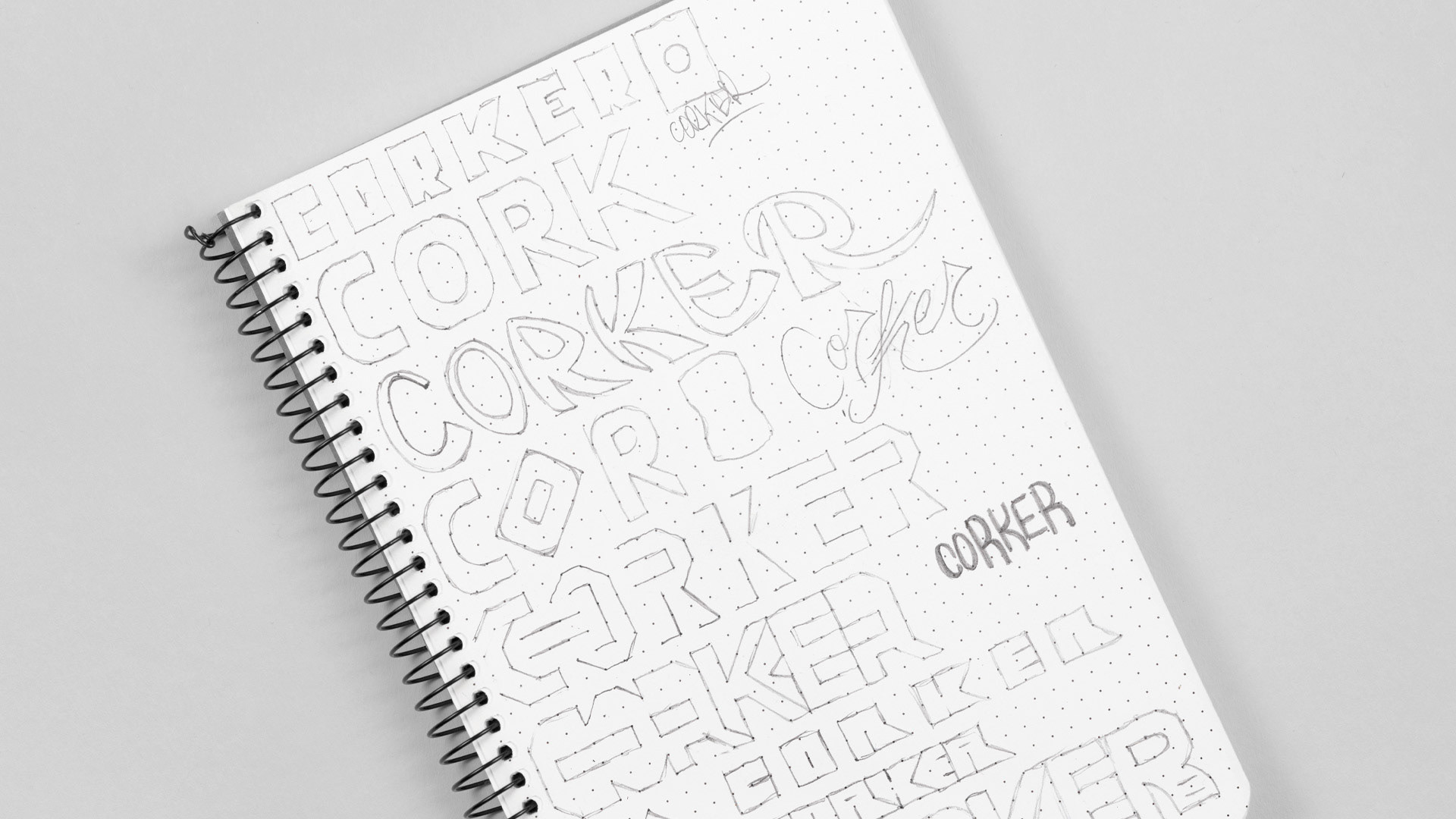
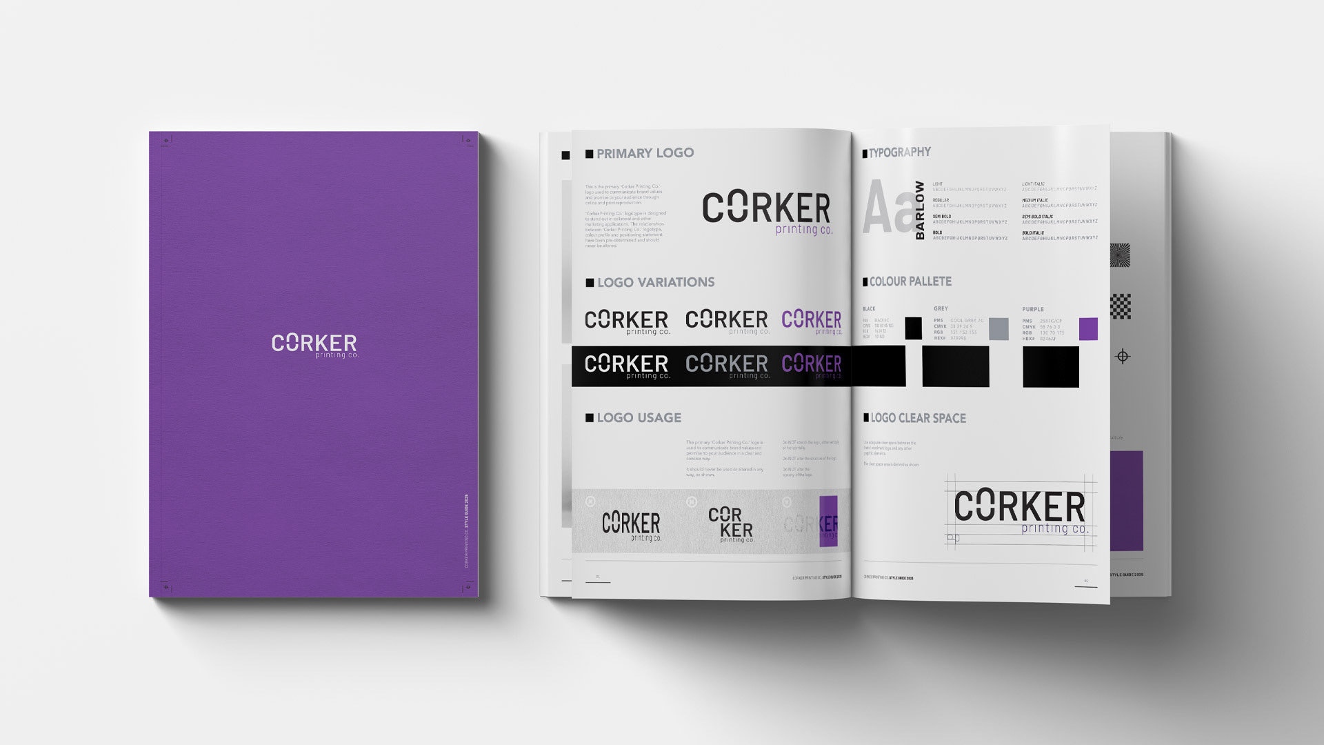
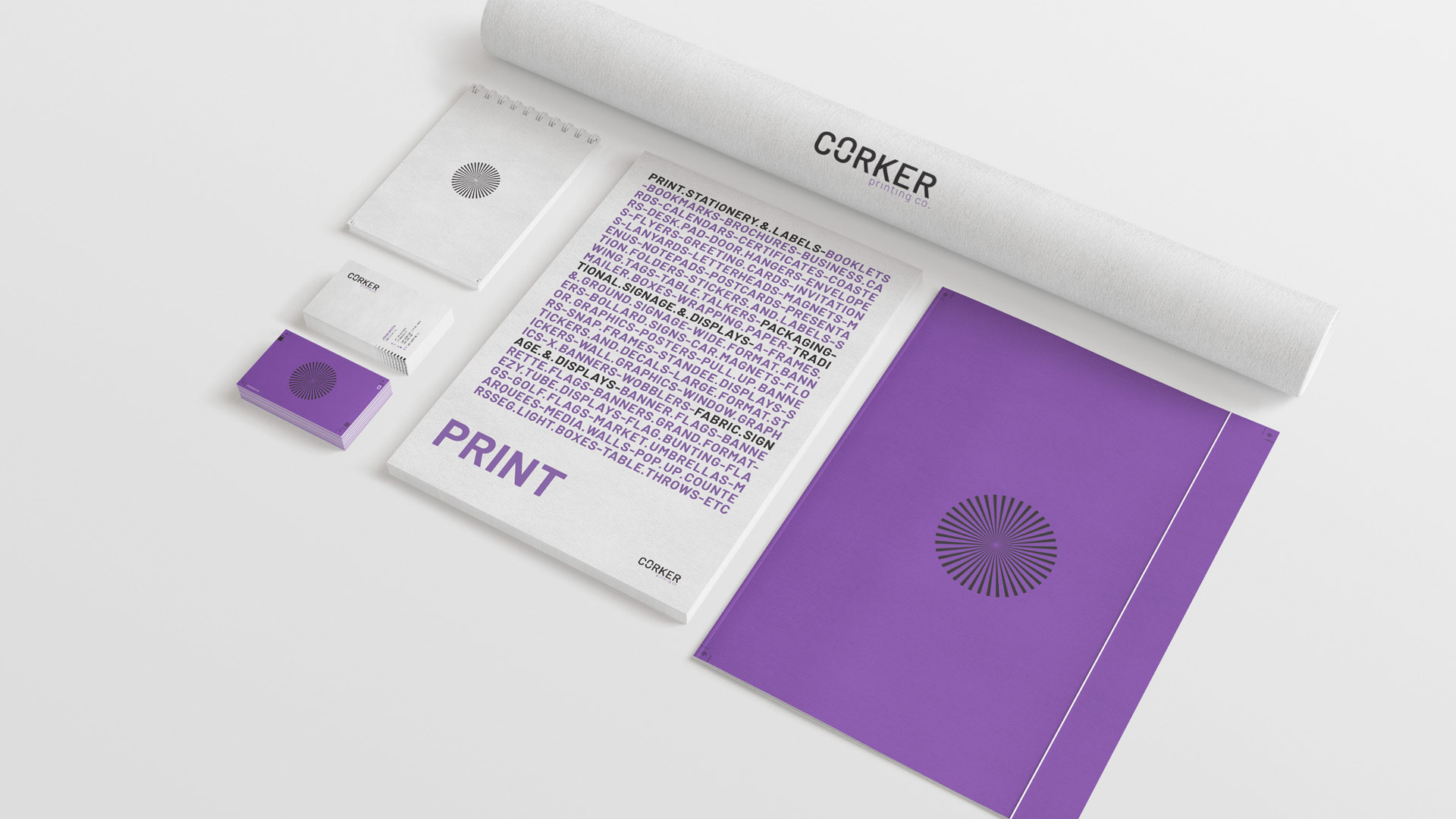
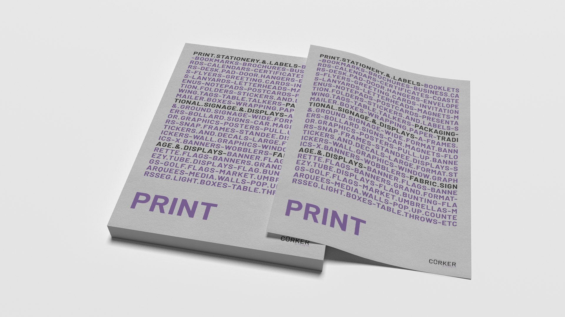
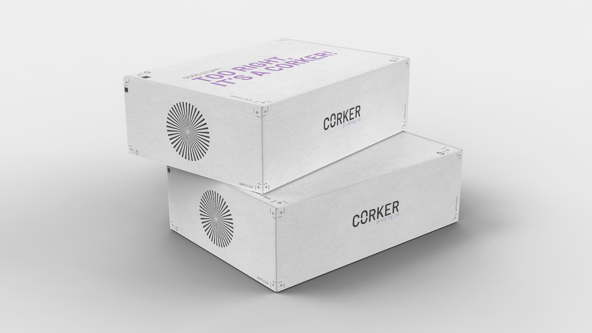
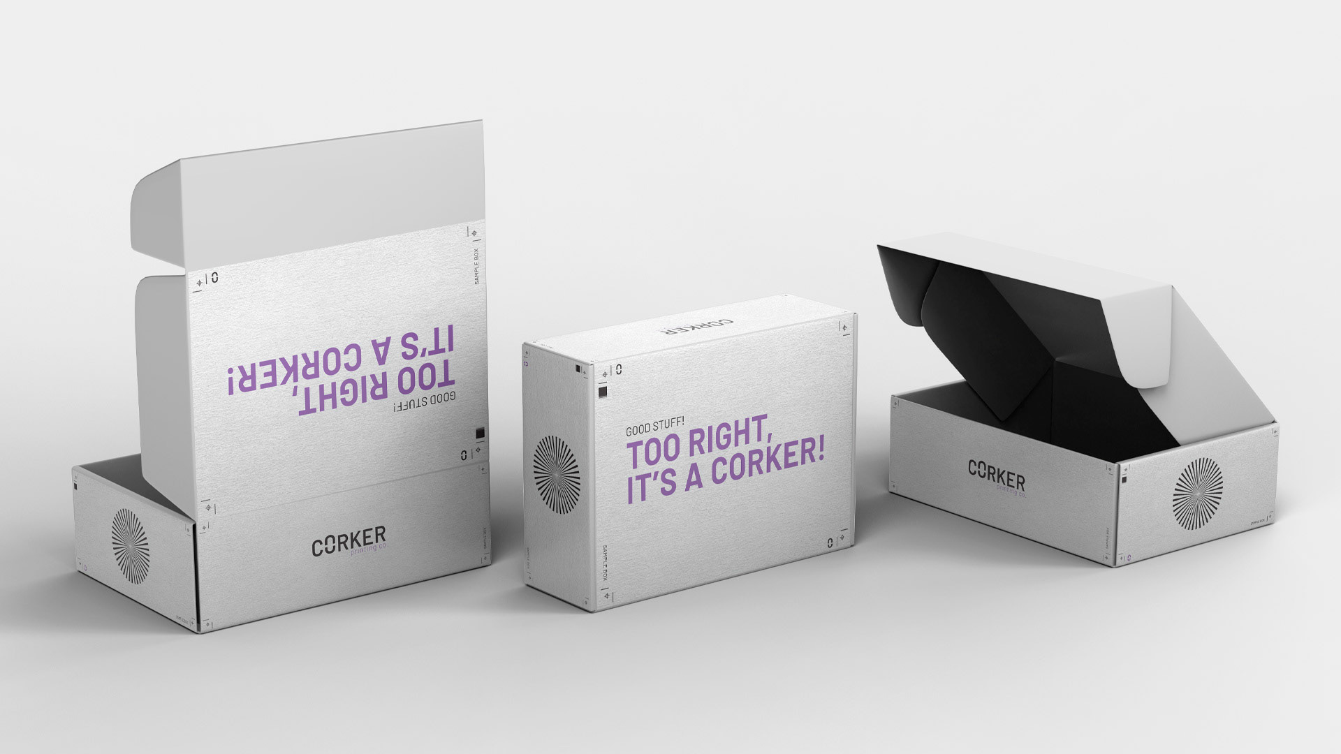
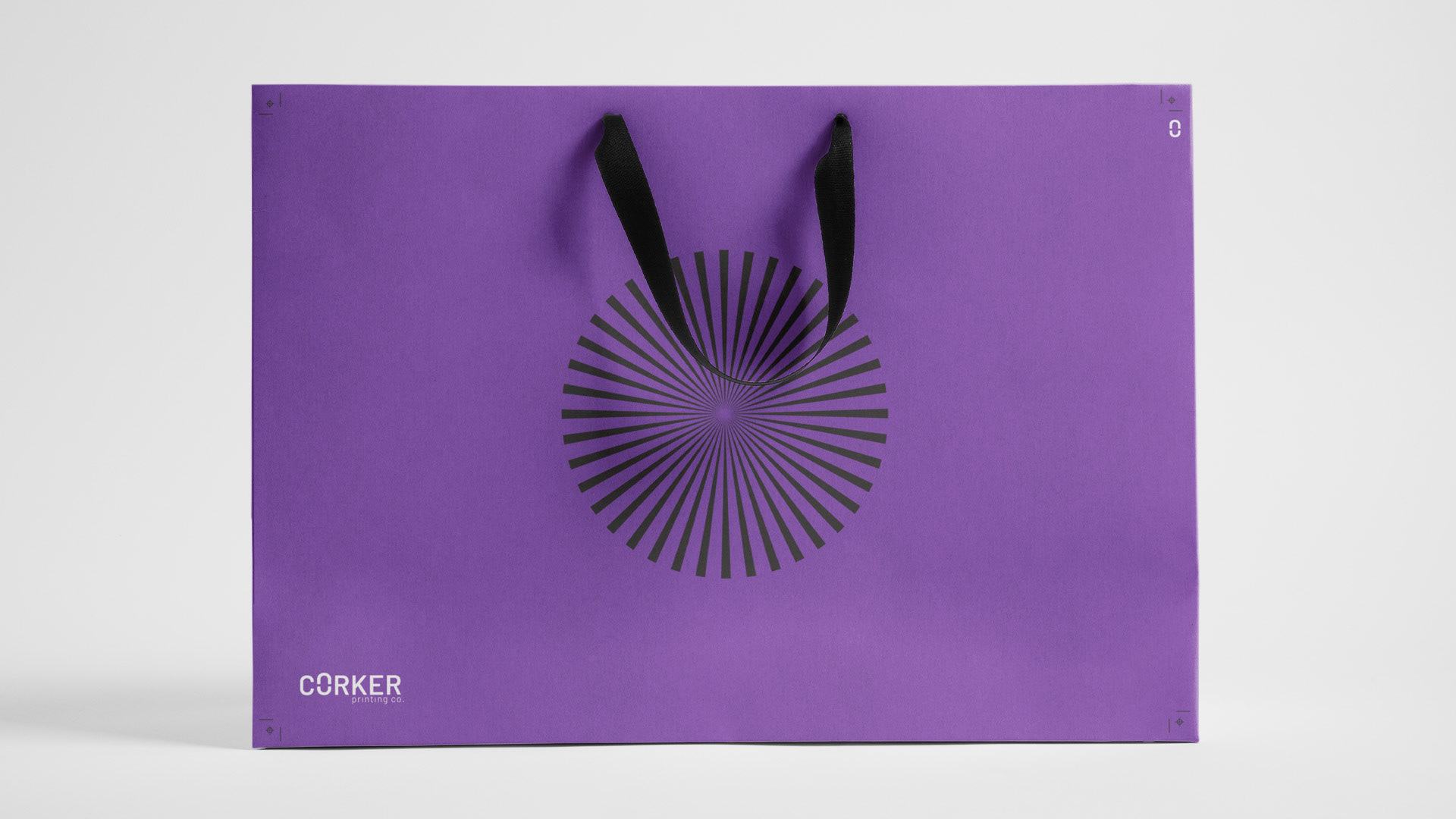
An Australian printing company, focused on delivering high quality services, required a new name and identity that reflects their values. “Corker,” an Australian slang word for “something excellent”, is familiar and local to capture all aspects of the brand promise. The wordmark logo and symbol I produced features a modified Barlow typeface with the ‘O’ symbolising sealing and permanence. Printing icons for supporting graphics and a sophisticated color palette reinforce the brand’s quality.